Arrow is far from being done, of course, but it has now reached a fairly usable state such that I can pause the coding and start working on the presentation, namely introducing it to people, and amplifying its usefulness. And presentation is also something that you can never really claim done. So I guess the mindset is the key here: something that grows and evolves can be much more fun and meaningful than a piece set in stone, so take your time.
By the way, I still want to explore ways to write my notes such that it neither imposes a psychological burden nor produces meaningless ramble. For one, effortless charm is something I aspire to, but not quite realistic, for quality writing is hard. Now quality is undoubtedly important, but more so is sustainability. How to make the right compromises and strike a good balance for a beginner seems a tricky question. But this should be a different piece, on writing specifically. Here I just wanted to reflect a bit. Like, I can be very to the point, but then it reads dry, like robot-speak. I guess one can learn the zen only through continued practicing.
Icon
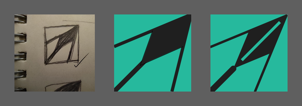
This is my first experience in icon making. I always knew that some abstract shape of an arrow would be something worth exploring, but getting to a concrete design is still full of uncertainty. I never learned to use Inkscape, but now with a real task in front of me, I knew I would have to sit down and take my time. Before getting to that though, I decided to stick to the analog way for the initial design phase, because drawing on paper was clearly more intuitive to me.
The icon has to be simple, namely something people can easily draw by hand, and easily remember. It has to be visually and aesthetically scalable, meaning it has to look good on all the sizes icons are typically displayed, from 16x16 to e.g. 192x192. But I was especially concerned with 16x16, not only because that's the icon size in browser tabs, but as my experience goes, if an icon looks beautiful on 16x16, it has most likely achieved very good aesthetic scalability. As a deduction, a good icon must be a simple one (otherwise it would implode on 16x16).
Not only the structure pattern needs to be simple, but also the color palette. I went with two-tone, the same turquoise-on-dark palette as used in the app itself. But since the background tone is dark gray, it's essentially monochromatic.
During my first brainstorming session, I quickly drew five patterns in square boxes, all of which were various abstractions of an arrow or arrowhead. Three of them were composed of curved shapes, but after some inspection, I found myself drawn the most to the very first design, consisting of all straight lines (for the record, it also had two curved variations). It is a simple pattern one can draw in three strokes, plus filling a bounded area.
Learning Inkscape
I have to say, I'm no longer used to reading instruction manuals for software. I thought apps today should be mostly self-explanatory, except for maybe a few tricks. But vector graphics programs, in fact most professional graphic design tools, I realized, required some good-old study and practice before one could get fluent and productive. As a complete newbie in this field, I didn't know how to use the Bezier tool, which turned out to be the most essential workhorse in creating a design. I learned a few basics such as paths vs. shapes (i.e. paths with constraints), the utility of guides and grids, and practically, how to control the rotation and skewing of a rectangle to make a desired parallelogram (e.g. with the help of guides).
On analogy paper, the design looked decent, but after I saw my first implementation rendered on screen, I was dismayed to see that on 16x16, the dark arrowhead looked like an overpowering blob of mass, way too heavy! I knew the head needed some structural division to make it visually balanced with the shaft and the rest structures. I thought of coloring half of the diamond shape using a lighter shade of gray, but rejected the idea because of the two-tone principle. It turned out that simply adding a bright and strong midline significantly lightens the head and on 16x16, the overall pattern felt much better balanced.
Another fun exploration was trying out multiple implementations to achieve the same result, in particular, the arrowhead was first drawn using basically a pair of angles facing in opposite directions, plus a filling bounded area (which was how I initially sketched it on paper), but the flaw was that this couldn't guarantee a true parallelogram, and the color filling wasn't super neat. That led me to the second attempt to draw the arrowhead as a single shape, a skewed and rotated rectangle, with the help of a diagonal guide. The result was a significant improvement over the first version. How similar is this to programming!
Website
As mentioned in a previous note, I decided to take the elm-lang.org approach, namely using plain Elm to make the presentation site for Arrow. But the elm-lang site is still trying to emulate a static site generator, and therefore, the project structure does not conform to that of a standard Elm project (e.g. there's no Main module, and the site content folder is not in the src-directories). This might be fine for something more freehand like JS, but a significant part of the Elm experience comes from its compiler messages, linting (e.g. elm-analyse), and also elm-format, but with a non-standard project, these in-editor functions are disabled. That eventually led me to push the whole site to a proper Elm project, that is, I'm making an Elm app to be used as a read-only website.
Expectedly, there was more upfront project setup required to get the first render. Why do I think this is worth it? First, I expect this to be not just a single-page poster kind of site, but instead, it will probably develop into a full-featured product site with routing, like a real SPA. The initial overhead was a bit daunting, but keep in mind that this paves the way for building up a sophisticated site without ever having to reach for extra tools. No hybrid or patchwork site, but a coherent and robust Elm SPA.
Plus I get to use Elm-UI to do the creative things. Beat that.
Another benefit of this back-to-the-basics site-building approach is that, except for a globally installed terser CLI for minifying compiled JS, I get to liberate the site from the npm world. Yes, live reload is handy, but not having to worry about node_modules is a breath of fresh air. Just a plain shell script for all. Thanks again, Evan.
Site Deployment
I chose S3 + Cloudfront for its industrial strength (instead of hipper things like Netlify, which I use for less mission-critical projects like traditional SSG sites). But Cloudfront is so dumb in one aspect, it turns out. I initially planned to host the preview app at arrow.treslumen.org/preview/, but specifying "default root object" (index.html) doesn't cut it, because, well, it's a subdirectory instead of the site root. The suggested solution is to run an edge function as a middleware to rewrite the request URL. What? I'm shocked because a major use case of Cloudfront is website hosting, and yet it doesn't have built-in handle of requesting a subdirectory?
It's not that I'm a cheapo and don't want to pay for such a stupid function. This is ugly, shameful, and a joke. OK I'm in dramatic mode, admittedly. But I search for different solutions. I already ditched the idea of registering a separate domain (guess what, cool things like "arrow.app" is long gone), because I think namespacing my apps with treslumen is a fine design. So the solution is the following: let's go further and reach for 2nd-level subdomain, preview.arrow.treslumen.org/. This actually wasn't the first time the idea came across, but I rejected it before because it looked ridiculously long. But when I revisited it, the absurdity went away, because in contrast to Cloudfront's little anti-UX detail, moving "preview" to the front of the URL isn't adding any extra typing at all. Plus, separating the presentation site's CDN distribution from the preview app's is most likely a good thing, because then they can be independently configured and monitored.
There was a minor inconvenience though. I learned that the existing certificate for *.treslumen.org cannot be used on the 2nd-level subdomain "preview", instead, a separate certificate is needed to protect *.arrow.treslumen.org. But that's not much work at all.
Take Baby Steps
Designing a website from scratch felt daunting, not only because there were so many details to worry about, but the immense artistic freedom actually worked against me. So I knew there's no way that I could produce a complete and yet polished site by the end of the month. Nobody was setting a deadline, I just thought that having something out for real, no matter how rudimentary, would be a meaningful token for the 3rd anniversary.
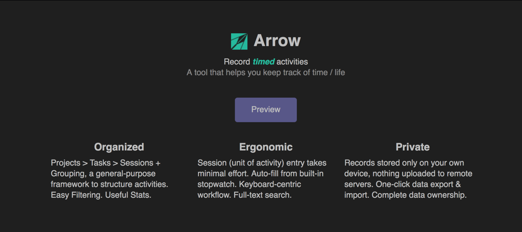
So I strived to get things started, producing an initial branding design (a combination of the icon and some preliminary slogan/tagline), followed by a Preview button linking to the hosted app, and then three product highlights in a row.
That's it for May 2021. Upcoming, I expect the next steps to be as follows:
- illustrated tips for feature discovery
- limitations of the current version
- ways to give feedback and receive project progress